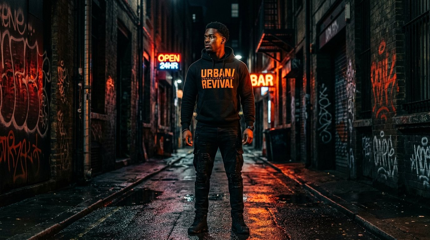
When you read a phrase on a graphic t-shirt, the message is conveyed twice: first through the literal meaning of the words, and second through the font and lettering design. In apparel graphics, typography is visual emotion.
The Power of Blackletter & Gothic Calligraphy
Blackletter fonts evoke heritage, rebellion, and heavy metal culture. When paired with modern streetwear silhouettes, gothic script delivers an edgy, timeless gravitas that elevates simple slogans into powerful visual emblems.
Distress Textures and Vintage Grain
Pristine, razor-sharp digital lettering can sometimes feel sterile on a t-shirt. Incorporating half-tone textures, weathered cracks, and faded ink effects softens the graphic, integrating it seamlessly into the woven texture of the cotton fabric.
Placement Matters: Arc, Stack, and Off-Center Layouts
Where typography sits on a garment dictates how the body looks. A curved arch across the upper shoulders accentuates frame width, while a vertical spine print down the back creates an elongating, streamlined silhouette.